What are components?
Some time ago, Knockout.js team released a new feature — components. This feature allows developers to build some custom components that will have their own view and logic. Registration of components looks almost like binding registration.
| 1 | ko.components.register('mywidget', { |
| 2 | viewModel: function(params) { |
| 3 | //Define view model here |
| 4 | this.title = ko.observable("Hello from component!!!"); |
| 5 | }, |
| 6 | template: '<div data-bind="text: title"></div>' |
| 7 | }); |
The example below looks very similar to the definition of user control in technologies like WPF/Silverlight or even WinForms. We have a template to define the view of the element and a view model to define logic.
Most interesting (for me personally) is the usage of these components as custom elements — custom HTML tags. after registration of my widget in the previous example you can write the following in your HTML code:
<mywidget></mywidget>
Brief description (skip it if you are already familiar with components)
And this HTML tag will be replaced with the template of the component with the applied component view model.
The template can be defined in the following way:
- With existing element id. The template element can be any existing element
divortemplateor anything else.
template: { element: 'my-component-template'}
Element content (only children of the element) will be cloned to a place where you apply your custom element
- With exciting element instance
template: { element: getElementById('...') }
- Directly with a string of markup
template: '<div data-bind="text: title"></div>'
- With an array of element instances (elements will be added sequentially)
- With AMD (Asynchronous Module Definition)
template: { require: 'text!some-template.html' }
Require.js or any other AMD module loader can be used. See https://github.com/amdjs/amdjs-api/blob/master/AMD.md for details.
For view-model configuration, you can use the following:
- Constructor function
| 1 | viewModel: function(params) { |
| 2 | //Define view model here |
| 3 | this.title = ko.observable("Hello from component!!!"); |
| 4 | } |
- An existing instance of the view model
viewModel: { instance: viewModelInstance }
- Factory function
| 1 | viewModel: { |
| 2 | createViewModel: function(params, componentInfo) { |
| 3 | return new ViewModel(params); |
| 4 | } |
| 5 | } |
Here we have an additional parameter componentInfo. This parameter allows us to get access to our custom element with componentInfo.element. But unfortunately, we can’t get access to this element before the template is applied and to analyze it, as it was initially added to the document. I’ll describe why I’ve said unfortunately a little later.
- Load view model through AMD
viewModel: { require: 'some/module/name' }
- Specify whole the component as a single AMD module
| 1 | define(['knockout'], function(ko) { |
| 2 | return { |
| 3 | viewModel: function(params) { |
| 4 | this.title = ko.observable("Hello from component!!!"); |
| 5 | }, |
| 6 | template: '<div data-bind="text: title"></div>' |
| 7 | }; |
| 8 | }); |
And register it with
ko.components.register('my-component', { require: 'some/module' });
What components are not?
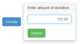
Let’s assume we would like to build a component for a bootstrap button with a popover. And we would like to open this popover when the button is clicked and when another button inside the popover is clicked we would like to call some handler in the view model. Something like a button with confirmation. And we would like to add a custom confirmation template with elements bound to the view of the model.

It would be nice to have a component with the following syntax
| 1 | <popover text="Donate" |
| 2 | data-bind="command: makeDonation" |
| 3 | title="Enter amount of donation"> |
| 4 | <input class='form-control text-right' type='text' |
| 5 | data-bind='value: donationAmount' /> |
| 6 | </popover> |
But unfortunately, it’s not possible. There is no way to read HTML content of the component applied as a custom HTML tag, because everything view-model factory, view-model constructor, and all other functions are called when the template is applied to the component and the template are a required parameter. Thus, you can’t build custom controls with templates inside. The only one possible option is to specify the template id as a parameter of your custom control.
| 1 | <template id='donate-template'> |
| 2 | <input class='form-control text-right' type='text' |
| 3 | data-bind='value: donationAmount' /> |
| 4 | </template> |
| 5 | |
| 6 | <popover text="Donate" |
| 7 | title="Enter amount of donation" |
| 8 | data-bind="command: makeDonation" |
| 9 | template="donate-template"> |
| 10 | </popover> |
Or use usual binding instead of component to specify template control
| 1 | <div class="btn btn-xs btn-primary"> |
| 2 | <div data-bind="popover: {title:'Enter ammount', command: makeDonation}" |
| 3 | class="hidden"> |
| 4 | <input class='form-control text-right' type='text' |
| 5 | data-bind='value: donationAmount' /> |
| 6 | </div> |
| 7 | Donate |
| 8 | </div> |
Let’s hope for future versions...


